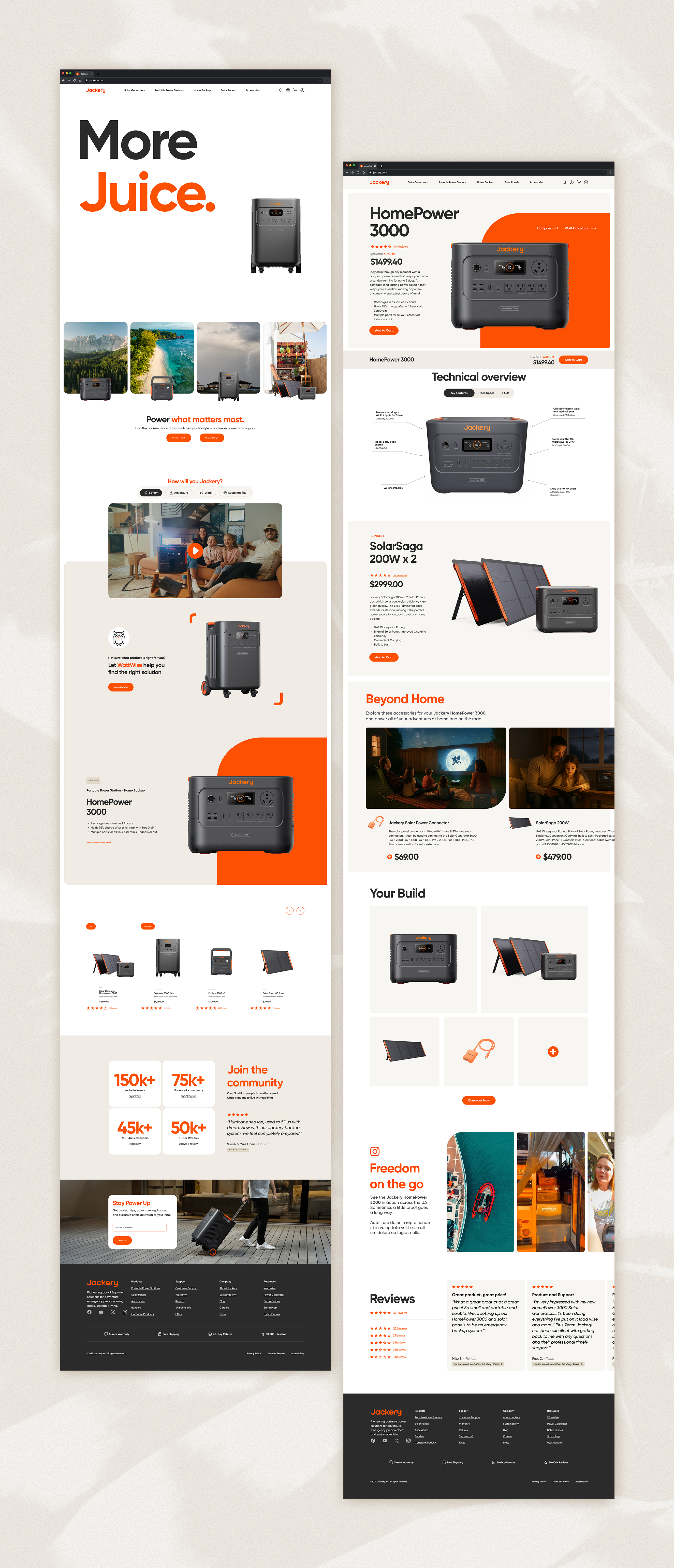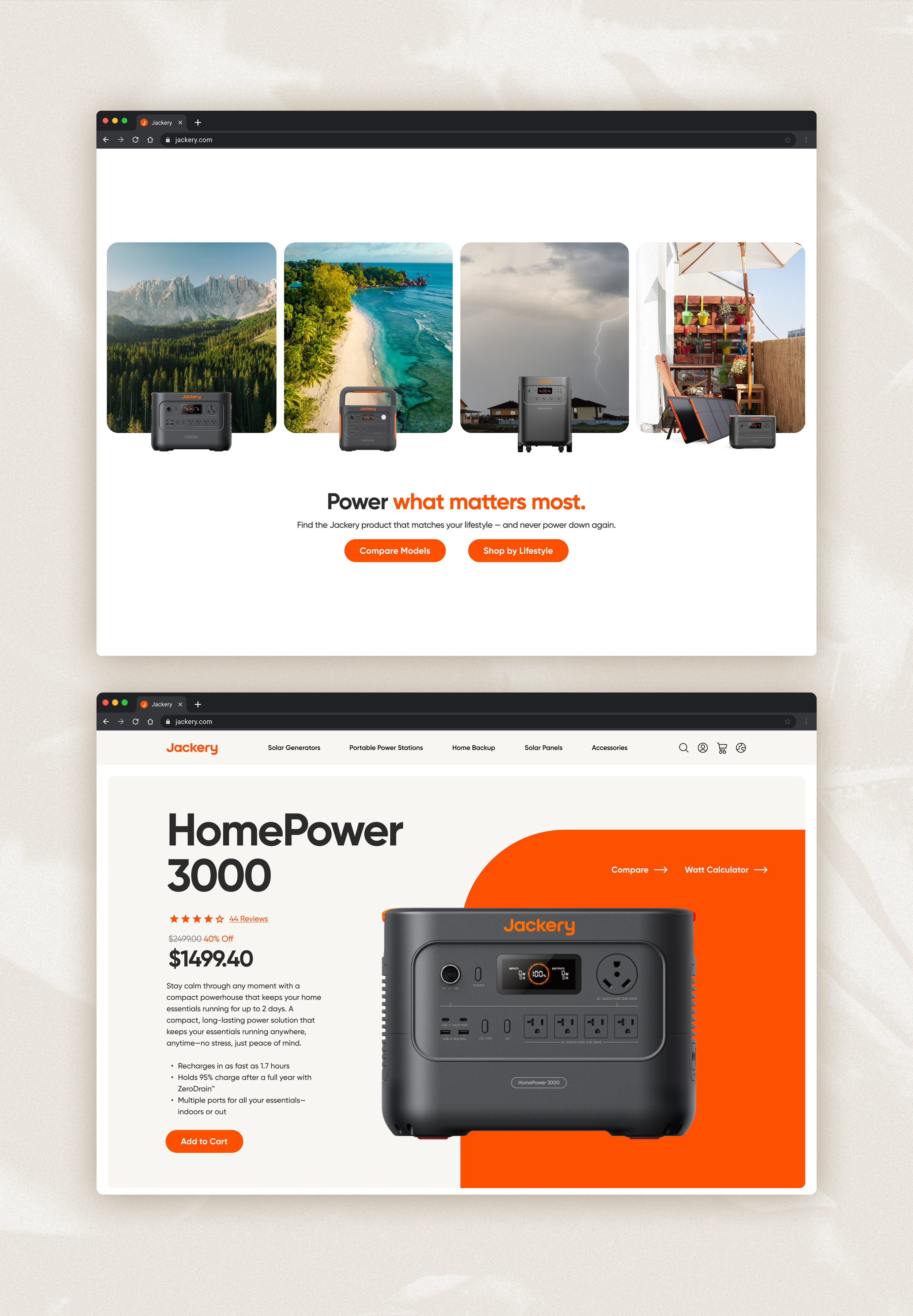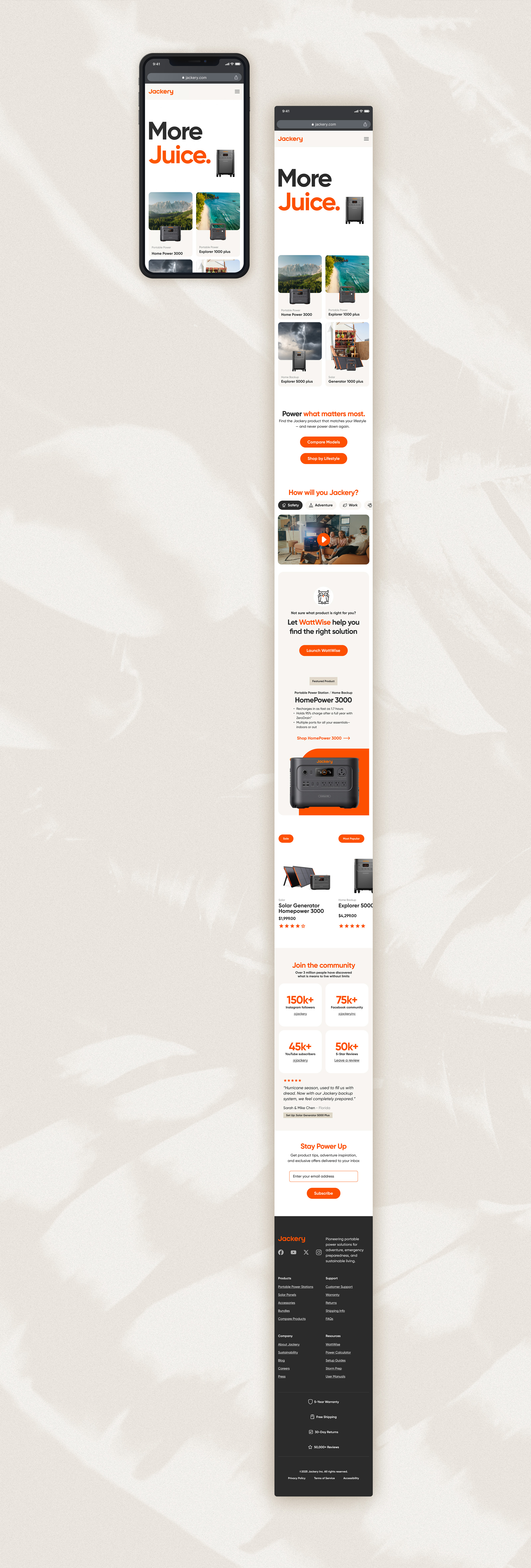


Jackery makes some of the best portable power stations on the market, but jackery.com works against itself — dozens of overlapping SKUs and a maze of use-case categories bury the product a shopper actually wants. As a four-day internal pitch project at VML, I led a UX/UI audit and redesign of the homepage and product detail page.
The diagnosis: this wasn’t a content problem; it was a wayfinding problem. So instead of redesigning around the existing taxonomy, I rebuilt the entry point around how people actually shop for power — by lifestyle, not SKU. The homepage opens with a scrollytelling hero building the brand promise before any product appears, then lands on a “Shop by Lifestyle” tool. The PDP replaces spec-sheet sprawl with a single annotated product image, bundle pricing, and a cross-sell that earns its place. Jackery’s orange stayed the only action color throughout, so the product could lead.