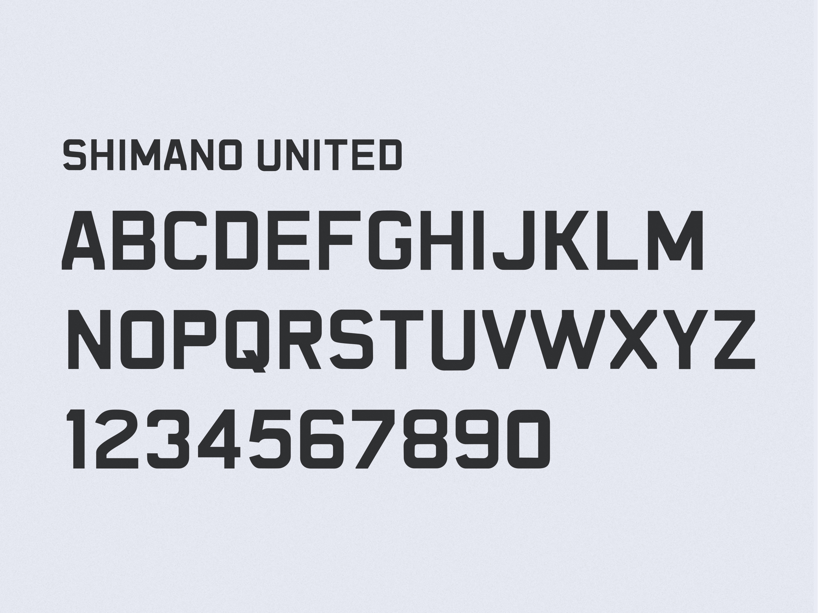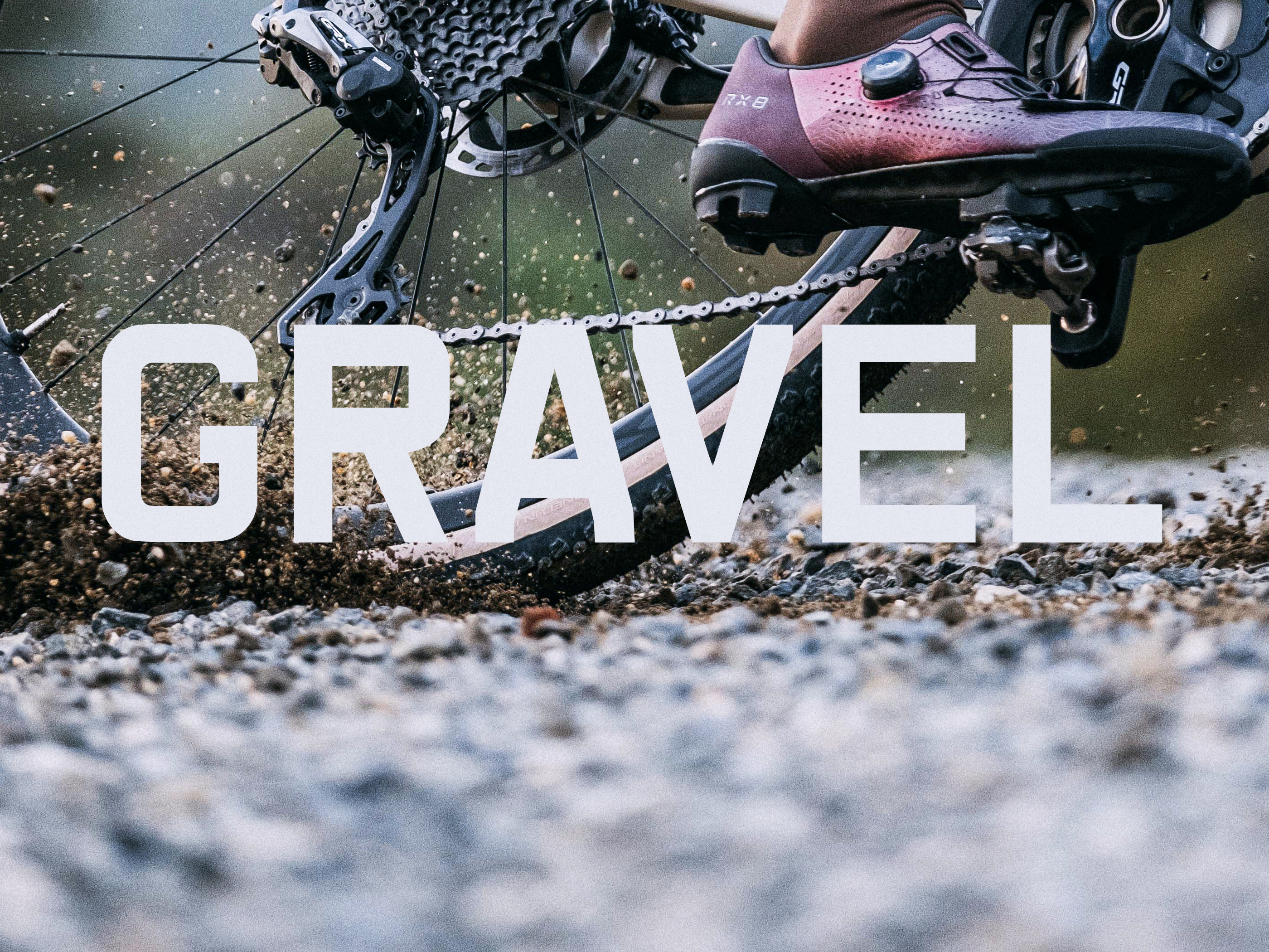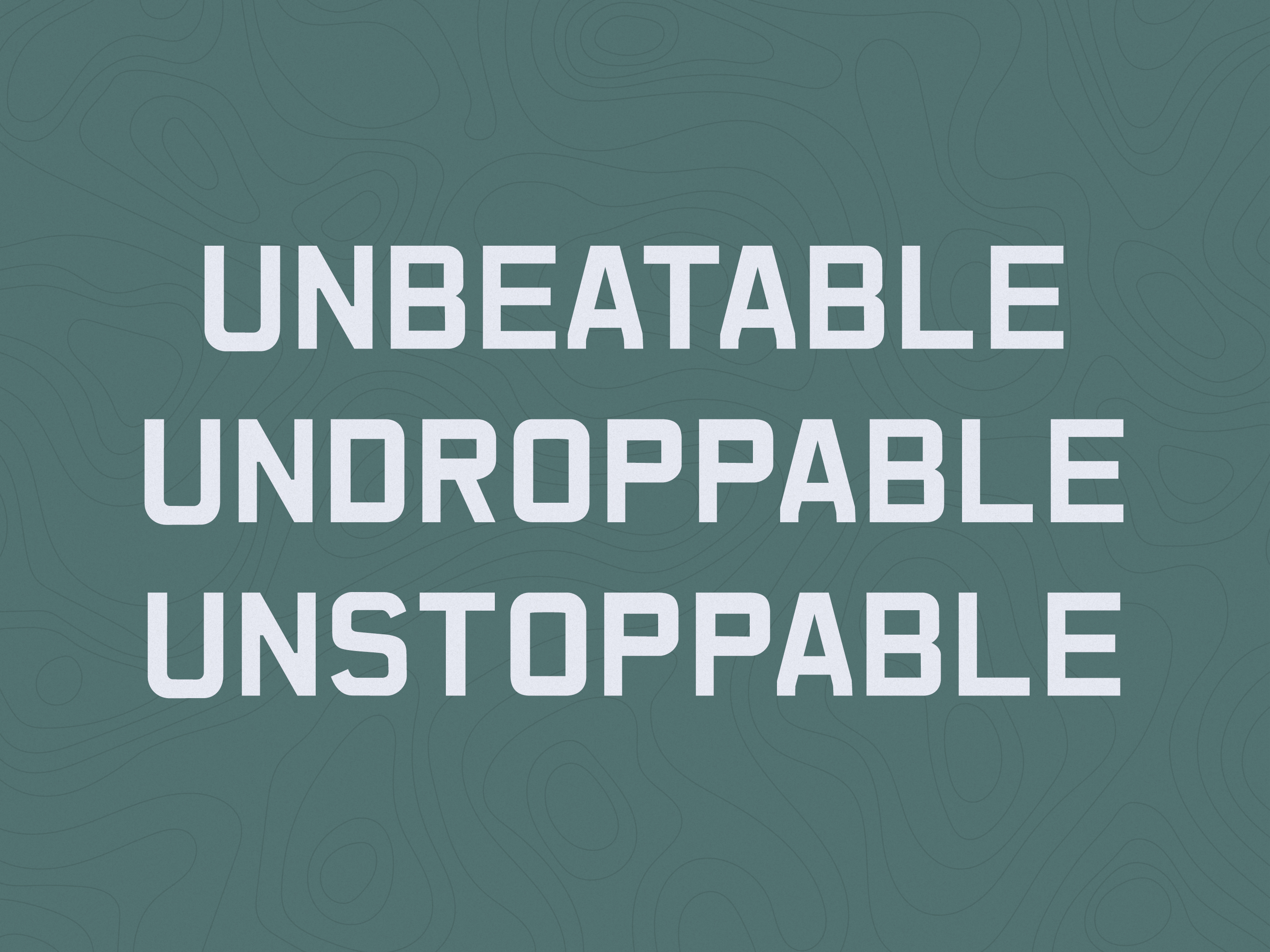


For Shimano’s GRX global rebrand, I designed a custom typeface, Shimano United, built out across multiple languages. The letterforms are intentionally imperfect. Curves that aren’t uniform, angles that aren’t precise, details that break from typical type design convention. That imperfection is the point. It represents the individuality that makes gravel riding great, the idea that not everything worth doing has to follow the rules.
Shimano
United